Project:
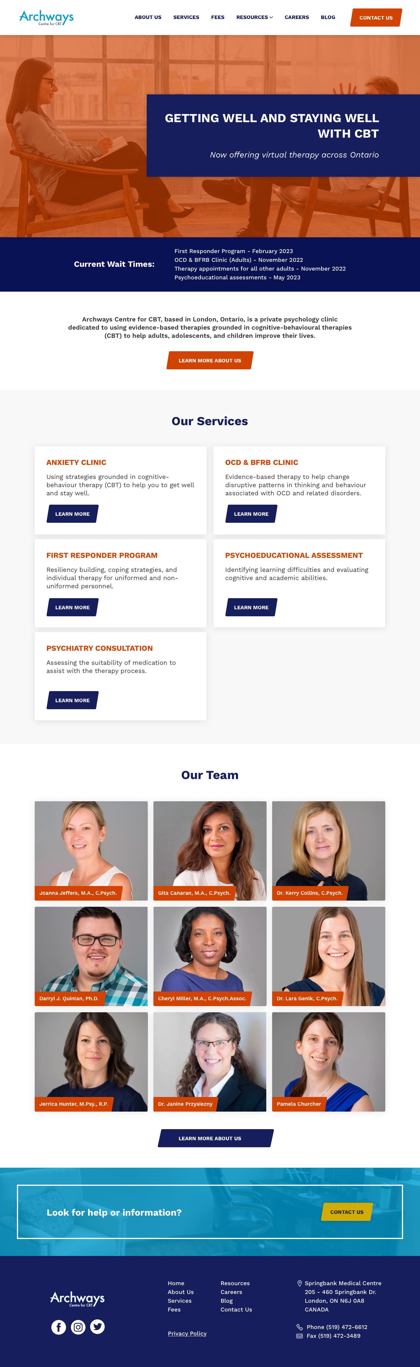
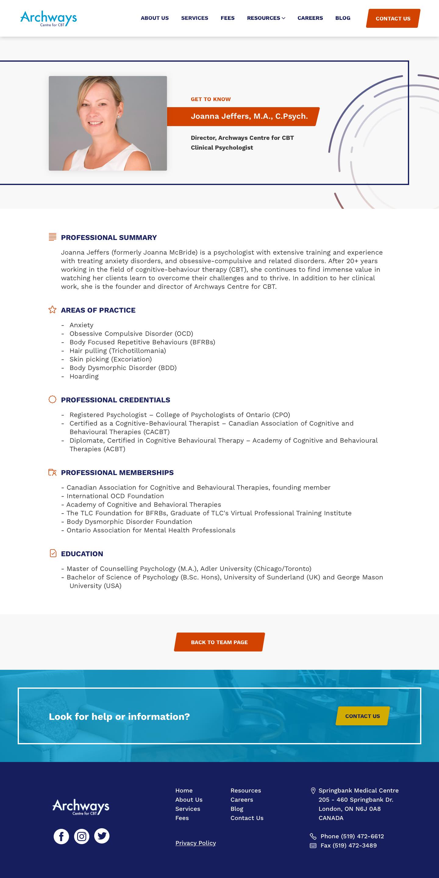
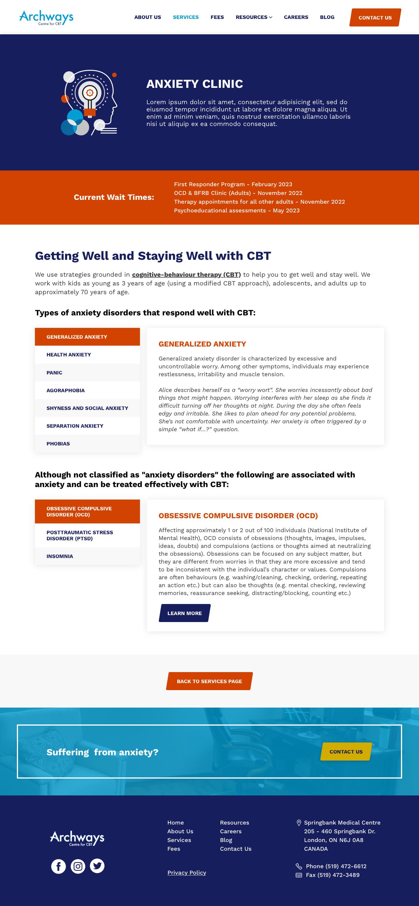
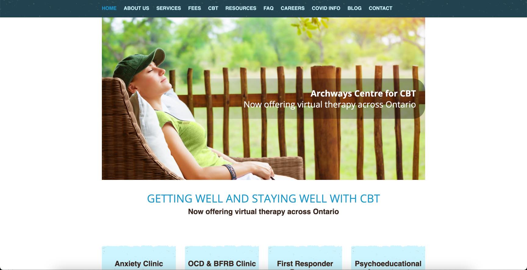
The old Archways website was quite outdated and needed a visual update. Joanna, the CEO of Archways, had a goal of generating more business and agreed that the website needed a more modern look and many pages had a lack of content and needed to be combined for easier navigation and better SEO.
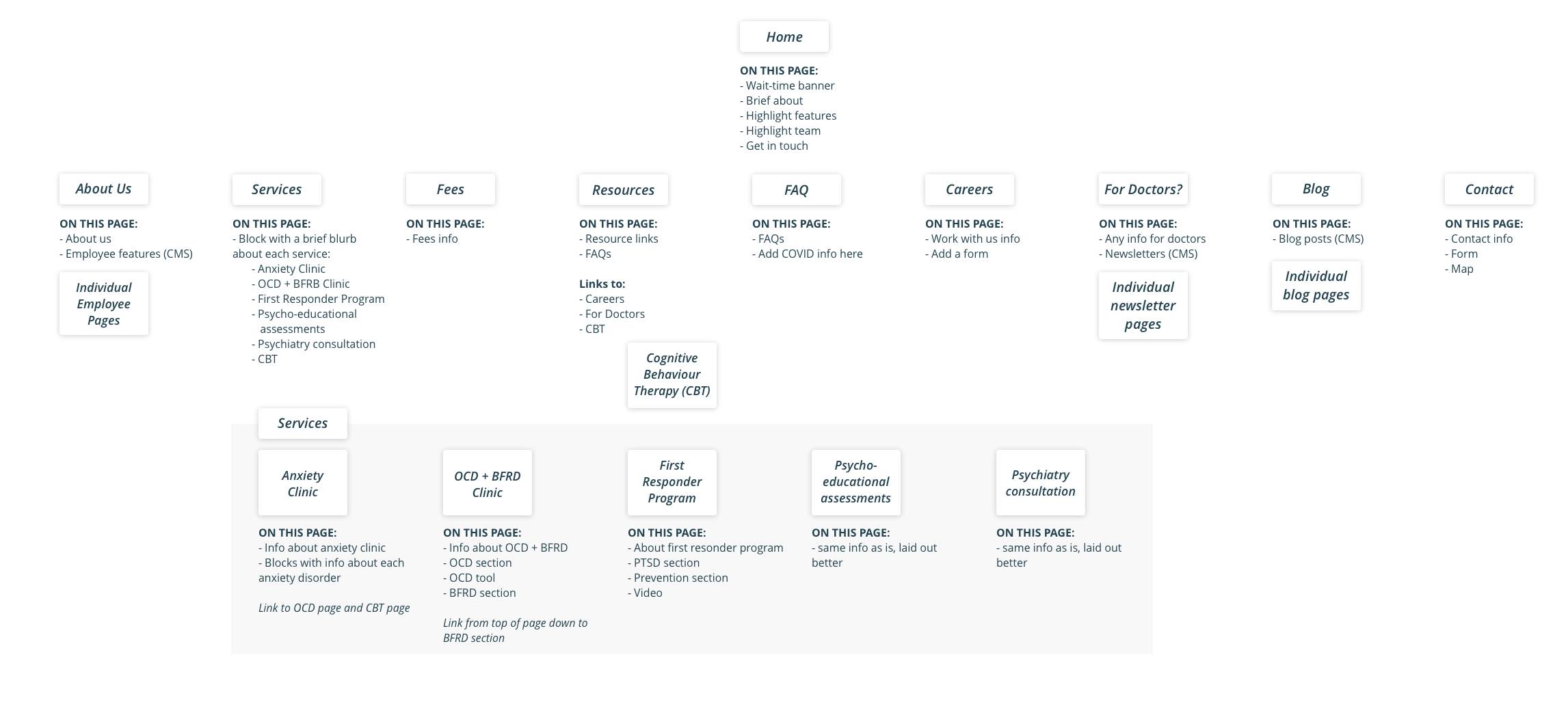
I started by creating a new sitemap flow since we needed to combine many of the pages together. I had a look at the user journeys to ensure our new approach was going to be an ideal client experience.
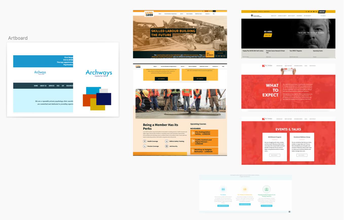
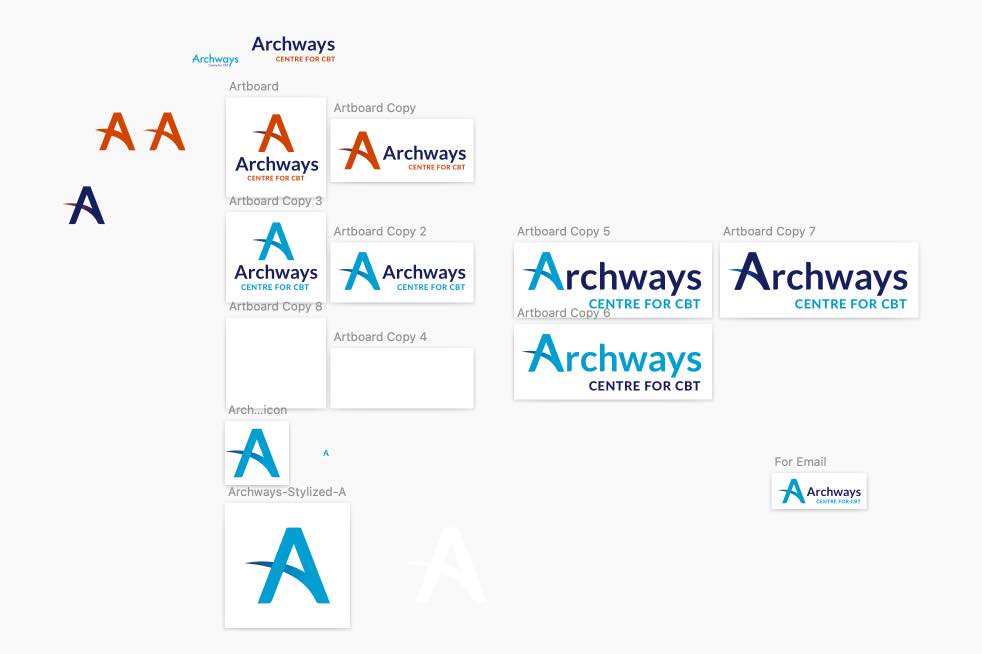
Joanna also decided that she wanted a logo and brand update. She really liked the look of a couple orange sites which landed me on her current orange and blue colour scheme which right away made her brand stand out from other similar businesses in her field and modernized the brand look.
We spiced up the Archways logo as well, nothing major, but incorporating the new dark blue and adding the ability for the A to stand alone. We played around with incorporating the orange as well, but Joanna ultimately decided to stick with just the blues.
I moved Archways' website over from Wordpress to Webflow which would be easier for Joanna to manage moving forward. The final Archways website design achieved what we originally wanted which was to create an updated and more modern look to the site, as well as making the user experience easy and straightforward. Right away, she got lots of positive feedback on usability from new and old clients!